
Click here to go directly to the tracker
Here’s very basic information to help you quickly get started using the tracker. A more detailed tutorial is available toward the bottom of this page.
- When you first load the tracker it will show statewide Georgia GHG emissions information for the most recent available month.
- To start exploring, just move the mouse to hover (without clicking) over any county on the map. The popup will show four crucial numbers for the that county’s monthly emissions, which you can compare to the same values for the entire state in the upper left of the screen.
- To explore in more depth, click on a county, and all the tracker numbers and visualizations will change to information for that county.
- At any time you can investigate still further by clicking on many individual elements showing on the screen, such as the colored bars on the bar chart or the buttons on the bottom right of the screen.
This tracker is one part of the larger Drawdown Georgia project, whose goal is building a movement in Georgia to accelerate progress toward net zero greenhouse gas emissions. The tracker gives us month-by-month snapshots of our current emissions in both the state as a whole and in our 159 individual counties.
Other resources you might find useful include:
A glossary of terms used in the tracker
Documentation slides for the data sources and calculation algorithms
A data download page to access the tracker’s detailed input data
Visualizing the carbon content of local grid electricity
GIS data and interactive maps for a variety of Georgia climate change datasets
Georgia Tech Climate and Energy Policy Laboratory Drawdown Georgia research portal
The drawdownga.org tracker page
Here’s a more in-depth tracker tutorial, using the example dashboard screen shown below.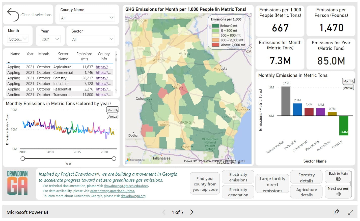
- First, scan the four cards with numbers in the upper right of the dashboard. These cards give us the most important summary numbers for the state as a whole in the most recent month for which we have data.
a. The card showing 667 tells us that for every 1,000 people in Georgia, in October 2021 we released 667 metric tons of greenhouse gases, or about 2/3 of a metric ton per person. Using metric tons per person allows us to fairly compare emissions from areas with smaller and larger populations, and to fairly compare local county emissions to statewide averages.
A metric ton is about 2,200 pounds. A full-size pickup truck weighs about two metric tons, as does a mid-size SUV. If your household has three people, in October 2021 your household released greenhouse gasses weighing as much as a full-size pickup truck or mid-sized SUV.
b. The card showing 1,470 converts 2/3 of a metric ton to pounds. The amount of 1,470 pounds is the equivalent of more than 350 four-pound bags of sugar.
c. The 7.3M number tells us that total statewide emissions released into the atmosphere, again in October 2021, were 7.3 million metric tons. That’s a lot: more than the weight of 3,500,000 pickup trucks or SUVs.
d. The fourth card shows the number 85.0M and tells us that the 2021 emissions from January to October sum to 85 million metric tons. By the end of 2021 we expect Georgia emissions will total about 100 million metric tons. - Look at the bar chart below the cards. The six bars break out emissions into separate sectors with transportation the largest emitting sector and forestry contributing negative(!) emissions. That’s because trees and plants pull CO2 out of the air and store it in biomass. In fact, more than ½ of Georgia is covered by trees, so the forest uptake of CO2 is almost large enough to offset transportation emissions from gasoline and diesel fuel.
Now look at the line chart in the lower left of the dashboard. The line solid line shows monthly (or annual) emissions since 2005. The dotted line shows that the overall trend is downward (good news), but (bad news) it is not going downward fast enough to reach zero by 2030 or 2050 and limit global warming to a safe, stable level.
Finally, the map in the center shows, across the state, the areas with higher emissions (in orange and red) and the areas with lower emissions (light green and dark green). - Now you can compare your local county emissions to the statewide numbers. On the color map in the center of the dashboard, move your mouse over your county without clicking. (If you don’t yet know your county, click on the “Find your county from your zip code” button at the bottom center of the dashboard, then return to the main dashboard screen.)
You should now see a popup of the same four cards for your county. Are emissions from your area higher or lower than state emissions? Your county might even have negative emissions! That can happen when a county’s trees are pulling more CO2 from the atmosphere than is being released from people in the county using electricity, gasoline, and other sources of greenhouse gasses.
You can also move the mouse (without clicking) over nearby counties, or any other county in the state, to see how that county compares to the state as a whole. - Finally, click the mouse on your county. The cards, sector bar chart, and time-series line chart now show data for your county rather than the state as a whole. From the bar chart, what are the largest sectors of emissions for your county? From the line chart, are your local emissions increasing, constant, or decreasing?
- These steps are enough to get you started but there’s lots more to explore.
Many elements of the dashboard are clickable, so you can use the slider under the line chart to change the period shown, or you can click on a sector of the bar chart to limit the dashboard map, cards, and charts to that particular sector.
The gray buttons at the bottom of the page will take you to additional dashboard screens so you can explore statewide and local emissions in more detail.
And, every month we’ll be updating the dashboard with the latest numbers.
Click here to go to the tracker.