
Click here to open the interactive map
A. Introduction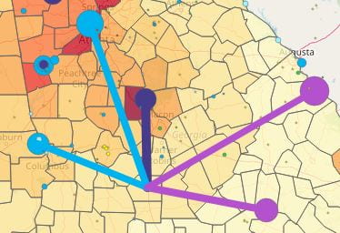
The purpose of this project is to provide local elected officials, concerned citizens, and interested businesses with information on the sources of their electricity and the amount of greenhouse gases released in the generation of that electricity. We would expect, for example, that a county located near one or more nuclear plants would generate lower emissions from electricity consumption compared to one located near fossil fuel plants. However, when we consume electricity from the grid we can not actually measure how much of that electricity comes from various power plants. Instead, for this project we have created a mathematical model of power-plant-to-county electricity flows using a spatial interaction model. Basic details on the model are given below in section D.
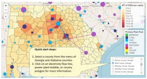
B. To use the map:
First identify a county of interest by clicking a county on the map, and note the county name in the popup. Then select a county using the menu in the lower right of the map to see the five largest sources of electricity for that county. You can use the mouse to hover over an item (power plant, county, or electricity flow) to identify an item, and click the mouse to see basic information about that item.
C. The major layers on the map are:
1. Electricity power plants, 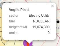 with the size of the circle representing the 2019 net electricity generation of the plant, and the color representing the plant’s primary fuel. The plant information is derived from the EPA eGRID dataset, which also contains CO2e emissions for each plant.
2. Modeled electricity flows 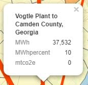 from plants to counties, modeled separately for the two major balancing authorities in Alabama and Georgia: the Tennessee Valley Authority in the northern portions of the two states, and the Southern Company in the middle and southern portions of each state. Only the largest five plant-to-county flows are rendered on the map. The widest red flow line is the maximum flow for that county. If a county has five equally wide flow lines, all five plants provide electricity amounts close to the maximum amount. Clicking on a flow opens a popup that shows the amount of electricity in the flow and the CO2e emissions released in the generation of that electricity.
3. Counties with population 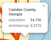 located (as points) at each county’s population-weighted centroid. The population and weighted centroid information are from the US Census Bureau. The counties’ color intensity is based upon the model’s summation of the CO2e emissions of the individual plant-to-county electricity flows, divided by the county population.
D. A few details of the spatial interaction model
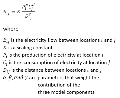
The gravity-style spatial interaction model is a simple one. Within each major balancing authority (TVA and Southern Company) in the two states every plant is connected to every county, including plants and counties in other states beyond Alabama and Georgia. Plant-to-county flows are estimated by multiplying (a) plant net generation times (b) county population, and dividing by (c) the shortest distance between plant and county via major transmission lines. The individual flows are then scaled so they sum to the correct net generation total for the balancing authority. It is possible to give different weights to the three model components by raising them to powers other than 1.0. In the following gravity model equation the alpha, beta, and gamma Greek letters represent the possible weights for each component:
The model and map visualization are written in the R statistics and data modeling language with some spatial analyses conducted in ArcGIS.
E. Limitations and potential improvements
1. The current model assumes three equally-weighted components: plant net generation, county population, and Euclidian distance. Each component could be weighted by raising it to a power other than 1.0. Distance, for example, might be squared, which would give plants closer to a county larger shares of a county’s electricity consumption. A real-world dataset of actual flows, even if a limited sample, could be used to estimate power coefficients for all three components. See further details below in section F.
2. County population is a rough proxy for electricity consumption. More refined consumption estimates (such as the ones generated by the Drawdown Georgia Geospatial Tracking project) would better reflect actual consumption.
3. As more and more rooftop and community-scale solar resources are developed, the county demand for grid electricity will be reduced.
4. Some electricity sources, such as hydro, bypass the transmission network and are fed directly into the distribution network.
5. There was no readily-available GIS dataset of balancing authority polygon regions. Instead we used the eGRID dataset to assign each county population-weighted centroid to the nearest power plant and adopted that power plant’s balancing authority for each county. In the modeling process we removed a number of small balancing authorities in the middle and southern portions of the two states, and assigned nearby counties to the Southern Company’s authority instead.
F. More on distance powers
To model each plant-to-county electricity flow, the current model multiplies plant net generation times county population and divides by the transmission-line distance between plant and county. The division by distance represents the “friction” of distance and the higher probability that an area’s electricity comes from closer plants rather than distant ones. If we substitute squared distance (or distance raised to any power larger than 1.0) when calculating flows, the model has more distant plants provide less electricity to an area and closer plants provide more.
To explore the effects of different distance powers on plant-to-county flows we have created a series of models using distance powers of 0.50, 0.75, 1.00, 1.25, 1.50, 1.75, and 2.00. To compare the effects of two or more powers, load the corresponding Web pages listed below into a Web browser. Click on the browser tabs (which are labelled with the model’s distance power value) to compare results. Note: the coloring of counties according to their per capita emissions changes from map to map, so the darker and lighter colors are not equivalent from map to map.
- Map with distance power = 0.50
- Map with distance power = 0.75
- Map with distance power = 1.00
- Map with distance power = 1.25
- Map with distance power = 1.50
- Map with distance power = 1.75
- Map with distance power = 2.00
G. Major data sources
1. EPA’s eGRID power plant dataset with 2019 data for generation and CO2e emissions: https://www.epa.gov/egrid
2. US Census Bureau’s county-level population-weighted centroid dataset with 2020 population: https://www.census.gov/geographies/reference-files/time-series/geo/centers-population.html
3. US Department of Homeland Security electricity transmission lines GIS dataset: https://hifld-geoplatform.opendata.arcgis.com/datasets/electric-power-transmission-lines